October 14, 2004
Japanese Typography
This article by Chris Palmieri is interesting even (or perhaps even more so) if you have no practical use for it. Although reading this and seeing how different the challenges can be might make one want to learn.
I’ve heard foreigners compare their first experience in Japan to everything from Disneyworld to The Planet of the Apes. Neither is particularly flattering or accurate, but they reflect the disorienting and uncanny similarities with and differences from their own culture that provide years of surprise for even the most jaded expatriate.
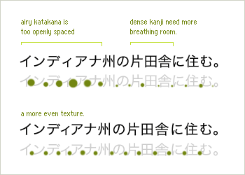
Japanese typography, especially for the web, can induce a similar experience for Western-trained designers. Many of the typographic rules we’ve learned and broken must be restated or discarded as irrelevant. Some typographic parameters that we’ve manipulated to great effect are no longer available, but are replaced by exciting new ones.